Lumeno AI - Personal AI Tutor
Overview
Type
Internship
Team
2 Designers, 1 PM
Timeline
Aug 2025 - Dec 2025
Skills
UX Design, Interface Design, Prototyping, Usability Testing
Context
Lumeno AI is a learning platform that gives students personalised study tools: chat-based tutoring, notes, flashcards, and a Study Plan generated from an uploaded syllabus.
As a product design intern, I owned the Study Plan feature end to end across web and mobile, working directly with the PM and CEO to ship a solution that improved feature adoption and reduced drop-off
THE CHALLENGE
Scattered features and low adoption
Students were activating but not returning. Lumeno had a core set of study tools, but usage data showed students were dropping off early in onboarding and not engaging with key features beyond the first session. Interviews revealed two compounding issues: the app's information architecture made it hard to discover what Lumeno offered, and students couldn't articulate what made it worth switching to from tools they already used
3 insights from interviews
Poor Information Architecture
Feature placement was scattered. Students couldn't map the app's structure to how they actually studied
Lack of Differentiation
Users described Lumeno as "just another AI study app." Nothing in the experience pointed to what made it distinct
Lack of Personalization
Students didn't feel the product adapted to their situation, their courses, or their schedule
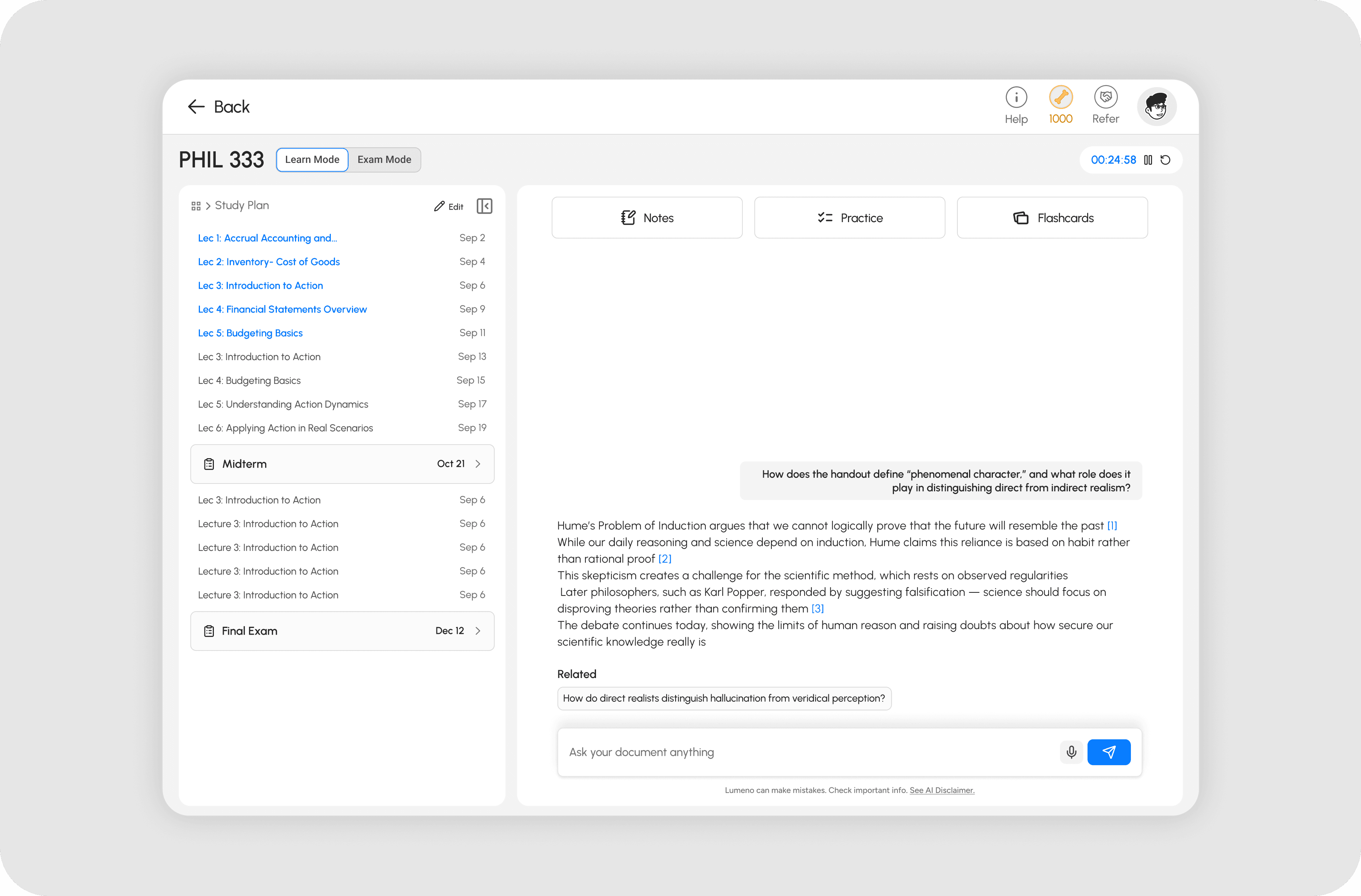
The Solution
Study Plan From a Single Syllabus Upload
Upload syllabus -> System auto-parses for modules, lectures and assessments -> One button per lecture.
Research showed students spend significant time at the start of each term manually parsing lengthy syllabi and rebuilding course structure in tools like Notion. The Study Plan feature tackled this directly: upload a syllabus, get an instant structured breakdown of modules, lectures, and assessments
Research and Concepts
Concept 1: Module-Based Structure
A file-manager layout with lectures nested inside modules. Users understood the hierarchy but got confused by the nesting depth and unclear calls to action. Too many decisions before they could do anything useful
Concept 2: Lecture-Based List
Removed nesting entirely. Cleaner, but only 10% of users preferred it. Scrolling through 24 to 36 lectures with no grouping added friction, and the checkbox UI for document uploads read as a task list rather than a study tool
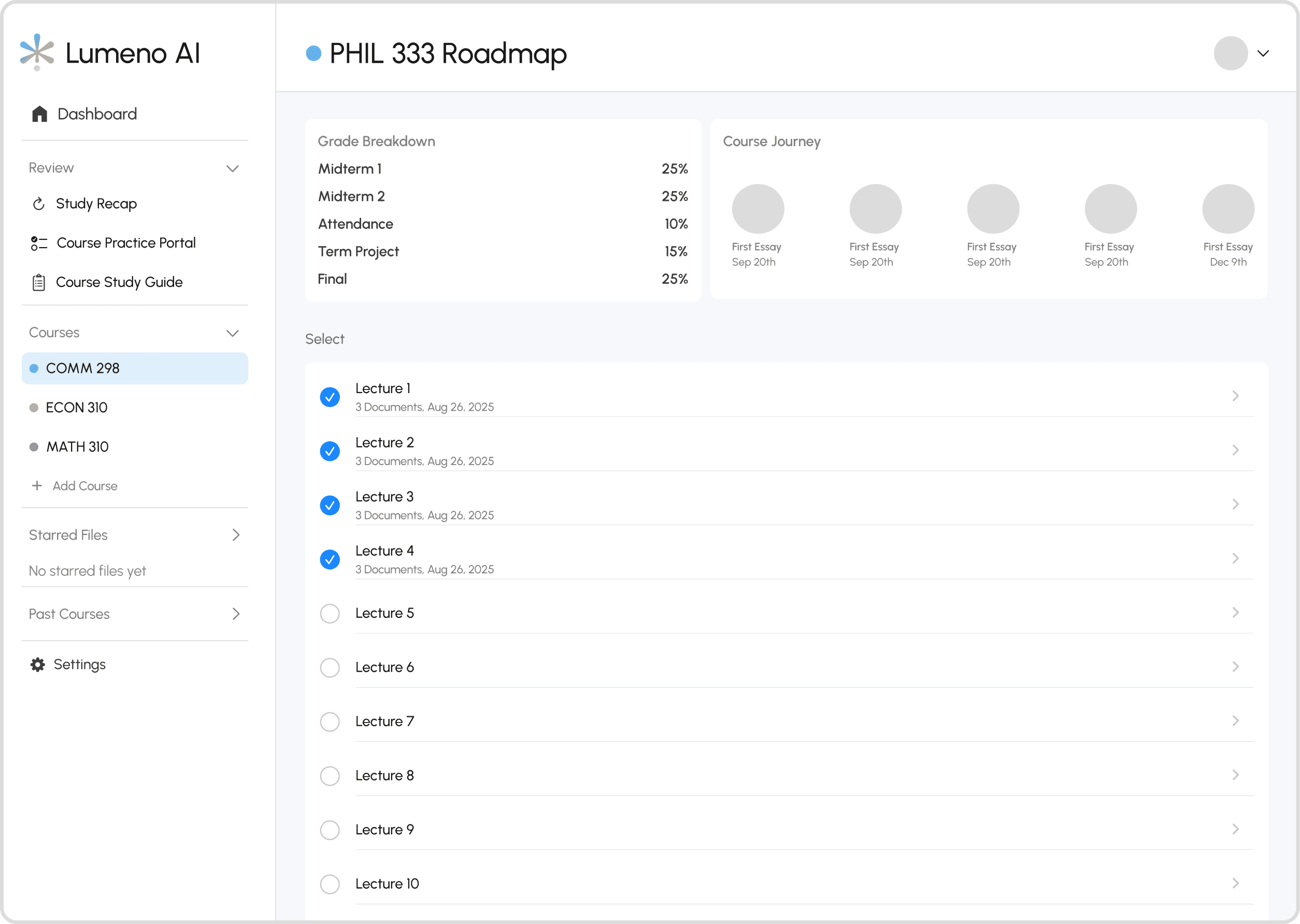
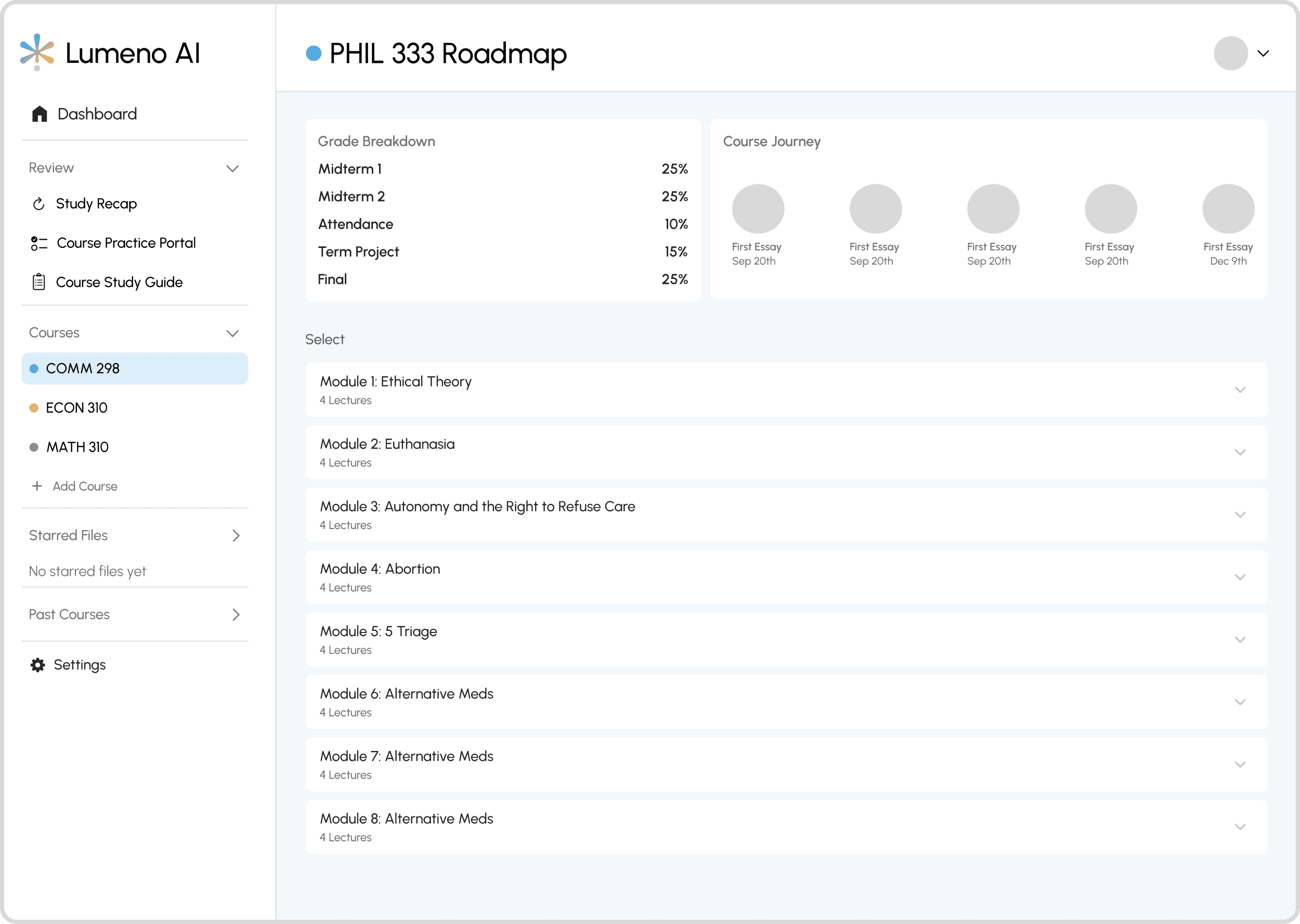
Concept 3: Split View
A modules menu on the left, lectures on the right. Users found it familiar and navigable. The main complaints were too many buttons and a grade tracking bar at the top that sat empty for most of the term, making it feel unfinished
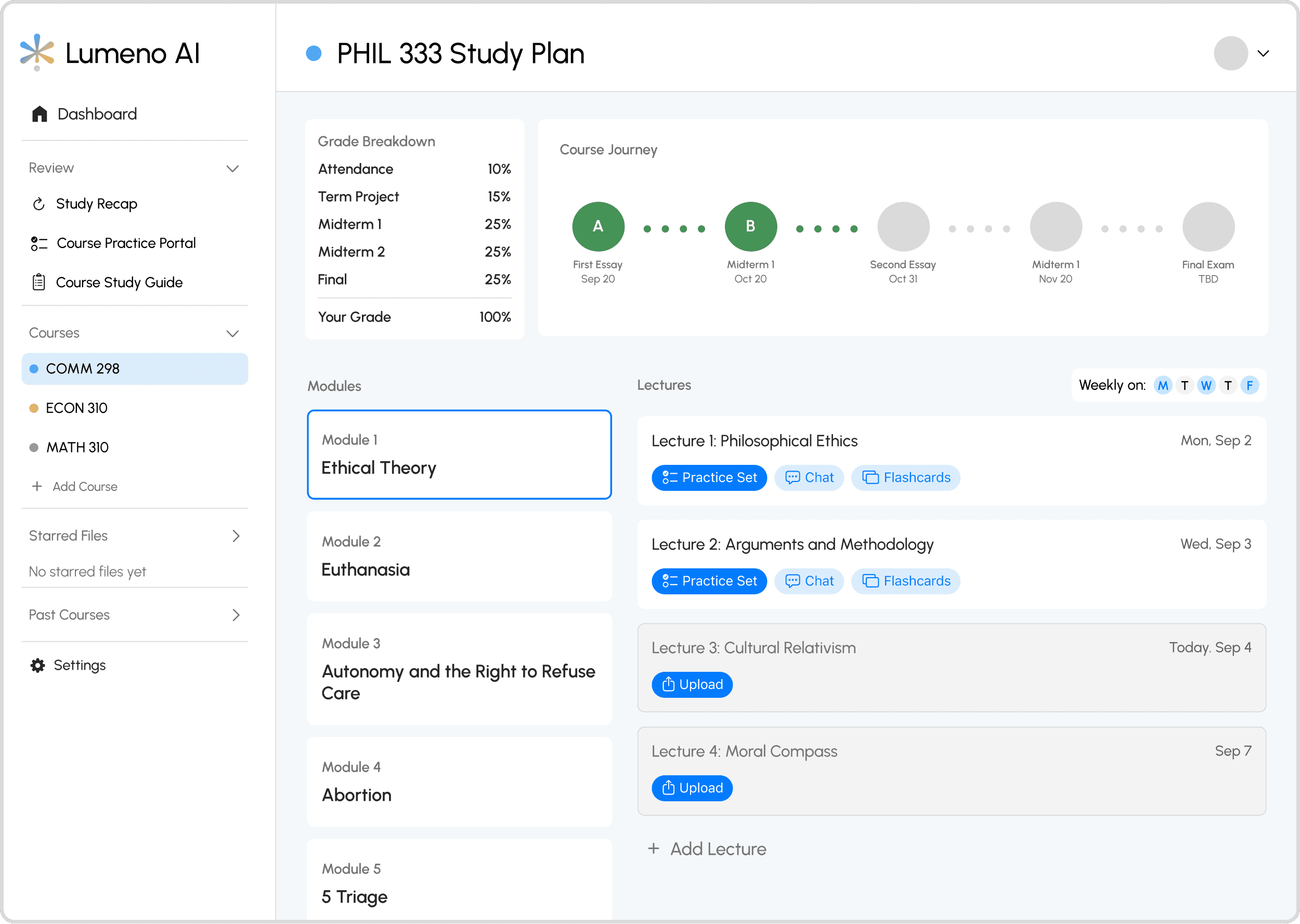
Winner - Split View (v2)
The final design replaced the grade bar with a vertical progress indicator tied to lecture completion, which felt lighter and more motivating. Buttons were reduced to the two actions users actually needed
User Response to Study Plan
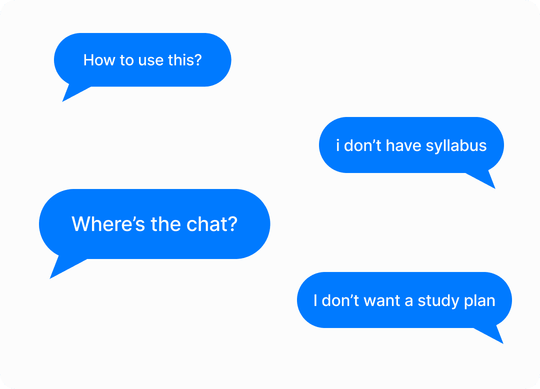
The concept was validated. The placement and framing were not
Users who completed the upload found the Study Plan genuinely useful and described it as a differentiating feature. First-year students in particular responded well, citing structure and organisation as things they actively needed. But drop-offs spiked at the upload step during onboarding, and support chat volume increased. Students weren't ready to commit to setup before they had seen any value from the app.
The Pivot
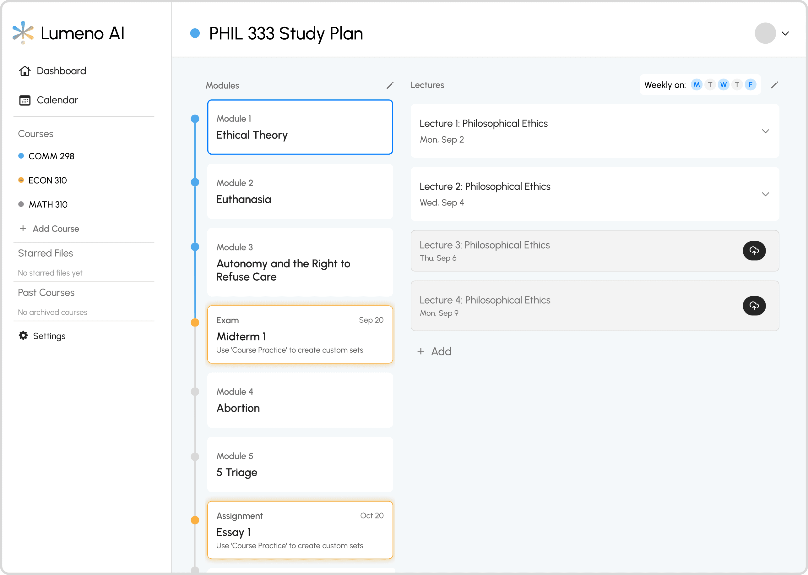
Pivot 1: Integration with Learning Interface
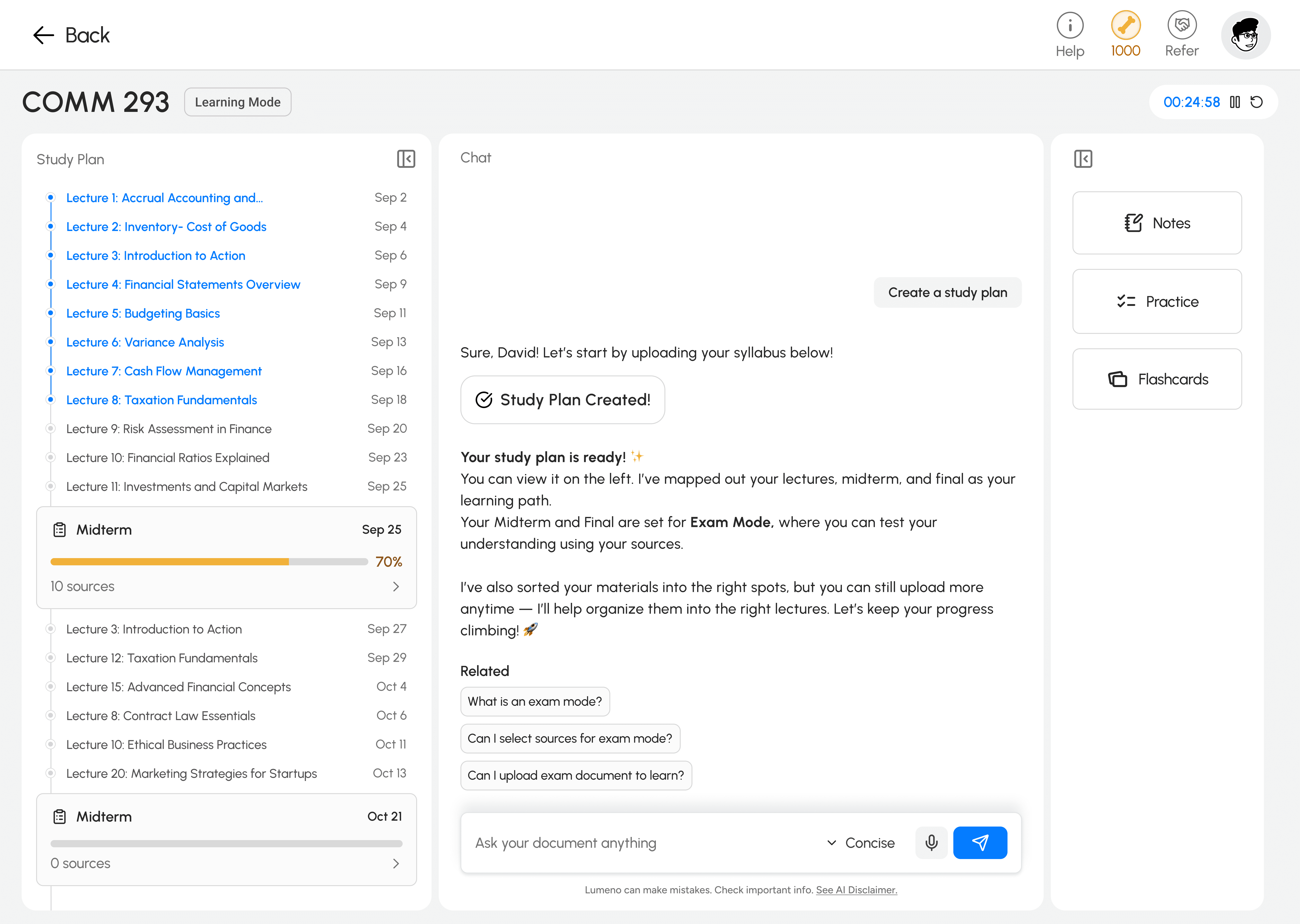
The Study Plan was moved to the learning feature itself, making it optional. Now, students jump straight to chat with Study Plan available on demand.
Pivot 2: Aligning with Users’ Existing Study Habits
The previous Study Plan assumed users studied lecture by lecture, forcing them to upload documents for each class and progress one at a time. However, interviews and behavioral insights revealed most students actually study around assessments. The redesign reflected this shift by allowing users to upload materials directly to each assessment section and study more efficiently from there.
The Impact
Reflection
I should have tested placement, not just the design.
I ran concept tests and usability sessions pre-launch. What I should have added was a staged rollout: release to 20% of users, measure drop-off, adoption rate, and time-to-first-study session. The signal would have come early enough to course-correct before full release.
The biggest design mistake was assuming ideal behaviour
I built Study Plan around how I assumed students should study: proactively, linearly, organised from day one. Most students study reactively, pulled by deadlines. Once I accepted that, the redesign was obvious. The job was to meet students where they were, not where I thought they should be
Usability testing is not the same as desirability testing
I was confident in the split-view design, and usability tests and interviews seemed to prove it worked. But once we launched, users completely ignored it. That gap between test results and real behavior taught me something important: testing confirms usability, not desirability. I had validated that users could use the feature, but not that they wanted to organize first when opening the app, and that is a completely different insight.